Making a bar chart
Now we’ll integrate everything we’ve learned so far to generate a simple bar chart with D3.
We’ll start by reviewing the bar chart we made earlier using div elements. Then we’ll adapt that code to draw the bars with SVG instead, giving us more flexibility over the visual presentation. Finally, we’ll add labels, so we can see the data values clearly.
The Old Chart
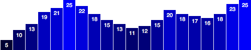
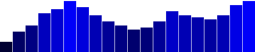
Here’s what we had last time, with some new data.
var dataset = [ 5, 10, 13, 19, 21, 25, 22, 18, 15, 13,11, 12, 15, 20, 18, 17, 16, 18, 23, 25 ];d3.select("body").selectAll("div").data(dataset).join("div").attr("class", "bar").style("height", function(d) {var barHeight = d * 5;return barHeight + "px";});

It may be hard to imagine, but we can definitely improve on this simple bar chart made of divs.
The New Chart
First things first, we need to decide on the size of the new SVG:
//Width and heightvar w = 500;var h = 100;
(Of course, you could name w and h something else, like svgWidth and svgHeight. Use whatever is most clear to you. JavaScript has a cultural fixation on efficiency, so you’ll often see single-character variable names, code written with no spaces, and other hard-to-read, yet programmatically efficient, syntax.)
Then, we tell D3 to create an empty SVG element and add it to the DOM:
//Create SVG elementvar svg = d3.select("body").append("svg").attr("width", w).attr("height", h);
This inserts a new <svg> element just before the closing </body> tag, and assigns the SVG a width and height of 500 by 100 pixels. This statement also puts the result into our new variable called svg, so we can easily reference the new SVG without having to reselect it later using something like d3.select("svg").
Next, instead of creating divs, we generate rects and add them to svg.
svg.selectAll("rect").data(dataset).join("rect").attr("x", 0).attr("y", 0).attr("width", 20).attr("height", 100);
This code selects all rects inside of svg. Of course, there aren’t any yet, so an empty selection is returned. (Weird, yes, but stay with me. With D3, you always have to first select whatever it is you’re about to act on, even if that selection is momentarily empty.)
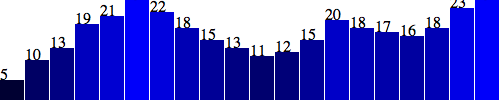
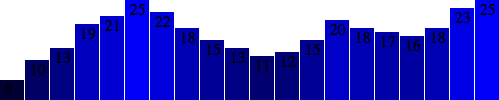
Then, For each of the 20 placeholders, Okay, maybe not. All of the bars are there (check the DOM of the demo page with your web inspector), but they all share the same Let’s fix the overlap issue first. Instead of an That works, but it’s not particularly flexible. If our data set were longer, then the bars would just run off to the right, past the end of the SVG! Since each bar is 20 pixels wide, plus 1 pixel of padding, then a 500-pixel wide SVG can only accommodate 23 data points. Note how the 24th bar here gets clipped: It’s good practice to use flexible, dynamic coordinates — heights, widths, x values, and y values — so your visualization can scale appropriately along with your data. As with anything else in programming, there are a thousand ways to achieve that end. I’ll use a simple one. First, I’ll amend the line where we set each bar’s Notice how the or only five: Here’s the working code so far. Now we should set the bar widths to be proportional, too, so they get narrower as more data is added, or wider when there are fewer values. I’ll add a new variable near where we set the SVG’s width and height and then reference that variable in the line where we set each bar’s It works! The bar widths and x positions scale correctly whether there are 20 points, only five or even 100: Finally, we encode our data as the height of each bar. You would hope it were as easy as referencing the Hmm, that looks funky. Maybe we can just scale up our numbers a bit? Alas, it is not that easy — we want our bars to grow upward from the bottom edge, not down from the top — but don’t blame D3, blame SVG. You’ll recall from the SVG primer that, when drawing Given that our bars do have to “grow down from the top,” then where is “the top” of each bar in relationship to the top of the SVG? Well, the top of each bar could be expressed as a relationship between the height of the SVG and the corresponding data value, as in: Then, to put the “bottom” of the bar on the bottom of the SVG, each Let’s scale things up a bit by changing Here’s the working code for our growing-down-from-above bar chart. Adding color is easy. Just use Here’s an all-teal bar chart. But often, you’ll want a shape’s color to reflect some quality of the data. That is, you may want to encode the data as color. (In the case of our bar chart, that makes a dual encoding, in which the same data value is encoded in two different visual properties: height and color.) Using data to drive color is as easy as writing a custom function that again references Here’s that code. This is not a particularly useful visual encoding, but you can get the idea of how to translate data into color. Here, Visuals are great, but sometimes you need to show the actual data values as text within the visualization. Here’s where value labels come in, and they are very, very easy to generate with D3. You’ll recall from the SVG primer that you can add Look familiar? Just as we did for the We’ll extend that code to include a data value within each and then extend it further, by including Aha! Value labels! But some are getting cut off at the top. Let’s try moving them down, inside the bars, by adding a small amount to the Better, but not legible. Fortunately, we can fix that: Fantasti-code! If you are not typographically obsessive, then you’re all done. If, however, you are like me, you’ll notice that the value labels aren’t perfectly aligned within their bars. That’s easy enough to fix. Let’s use the SVG Then, let’s change the way we calculate the And I’ll also bring the labels up one pixel for perfect spacing: Done! Now, let’s branch out from bar charts.data(dataset) sees that we have 20 values in the data set, so it calls join() 20 times.join("rect") inserts a rect into the DOM. As we learned in the SVG primer, every rect must have x, y, width, and height values. We use attr() to add those attributes onto each newly created rect.
x, y, width, and height values, with the result that they all overlap. This isn’t a visualization of data yet.x of zero, we’ll assign a dynamic value that corresponds to i, or each value’s position in the data set. So the first bar will be at zero, but subsequent bars will be at 21, then 42, and so on..attr("x", function(d, i) {
return i * 21; //Bar width of 20 plus 1 for padding
})


x position:.attr("x", function(d, i) {
return i * (w / dataset.length);
})
x value is now tied directly to the width of the SVG (w) and the number of values in the data set (dataset.length). This is exciting, because now our bars will be evenly spaced, whether we have 20 data values

//Width and height

    var w = 500;
    var h = 100;
var barPadding = 1; // <-- New!
width. Instead of a static value of 20, the width will now be set as a fraction of the SVG width and number of data points, minus a padding value:.attr("width", w / dataset.length - barPadding)


d data value when setting each bar’s height:
.attr("height", function(d) {
return d;
});

.attr("height", function(d) {
return d * 4; // <-- Times four!
});
rects, the x and y values specify the coordinates of the upper-left corner. That is, the origin or reference point for every rect is its top-left. For our purposes, it would be soooooo much easier to set the origin point as the bottom-left corner, but that’s just not how SVG does it, and, frankly, SVG is pretty indifferent about your feelings on the matter.
.attr("y", function(d) {
return h - d; //Height minus data value
})
rects height can be just the data value itself:
.attr("height", function(d) {
return d; //Just the data value
});

d to d * 4. (Note: Later we’ll learn about D3 scales, which offer better ways to accomplish this.)
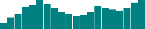
Color
attr() to set a fill:
.attr("fill", "teal");
d. Here, we replace "teal" with a custom function:
.attr("fill", function(d) {
return "rgb(0, 0, " + (d * 10) + ")";
});
d is multiplied by 10, and then used as the blue value in an rgb() color definition. So the greater values of d (taller bars) will be more blue. Smaller values of d (shorter bars) will be less blue (closer to black).Labels
text elements to an SVG element. We‘ll start with:
svg.selectAll("text")
.data(dataset)
.join("text")
rects, here we do for the texts. First, select what you want, bring in the data, and finally join the data to new text elements to the DOM.text element by using the text() method
.text(function(d) {
return d;
})
x and y values to position the text. It’s easiest if I just copy and paste the same x/y code we used above for the bars:
.attr("x", function(d, i) {

      return i * (w / dataset.length);
    })
.attr("y", function(d) {
return h - (d * 4);
});
x and y calculations:
               .attr("x", function(d, i) {

              return i * (w / dataset.length) + 5;  // +5
           })
           .attr("y", function(d) {
              return h - (d * 4) + 15;        // +15
           });
               .attr("font-family", "sans-serif")

           .attr("font-size", "11px")
           .attr("fill", "white");

text-anchor attribute to center the text horizontally at the assigned x value:
.attr("text-anchor", "middle")
x position by setting it to the left edge of each bar plus half the bar width:
              .attr("x", function(d, i) {

            return i * (w / dataset.length) + (w / dataset.length - barPadding) / 2;
          })
              .attr("y", function(d) {

            return h - (d * 4) + 14;  //15 is now 14
          })