Axes
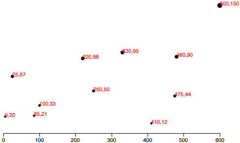
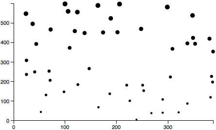
Having mastered the use of D3 scales, we now have this scatterplot:
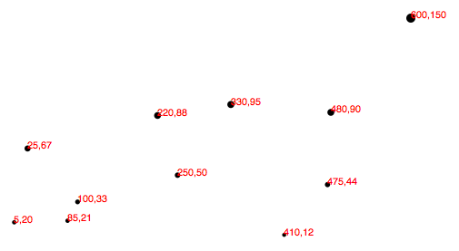
Let’s add horizontal and vertical axes, so we can do away with the horrible red numbers cluttering up our chart.
Introducing Axes
Much like the scale functions, D3’s axes are actually functions whose parameters you define. Unlike scales, when an axis function is called, it doesn’t return a value, but generates the visual elements of the axis, including lines, labels, and ticks.
Note that the axis functions are SVG-specific, as they generate SVG elements.
Setting up an Axis
When you create an axis, D3 wants to know its orientation (vertical or horizontal) and where the labels should appear relative to the axis. The options are pretty self-explanatory: d3.axisTop(), d3.axisRight(), d3.axisBottom(), d3.axisLeft().
Use d3.axisBottom() to create an axis function, where the axis will be horizontal and the ticks (the marks along the axis marking the divisions) will be drawn below the horiztonal axis line:
var xAxis = d3.axisBottom();
At a minimum, each axis also needs to be told on what scale to operate. Here we’ll pass in the xScale from the scatterplot code:
xAxis.scale(xScale);
Of course, we can be more concise and string all this together into one line:
var xAxis = d3.axisBottom().scale(xScale);
Finally, to actually generate the axis and insert all those little lines and labels into our SVG, we must call the xAxis function. I’ll put this code at the end of our script, so the axis is generated after the other elements in the SVG:
svg.append("g").call(xAxis);
D3’s call() function takes a selection as input and hands that selection off to any function. So, in this case, we have just appended a new g group element to contain all of our about-to-be-generated axis elements. (The g isn’t strictly necessary, but keeps the elements organized and allows us to apply a class to the entire group, which we’ll do in a moment.)
That g becomes the selection for the next link in the chain. call() hands that selection off to the xAxis function, so our axis is generated within the new g. That snippet of code above is just nice, clean shorthand for this exact equivalent:
svg.append("g").call(d3.axisBottom().scale(xScale));
See, you could cram the whole axis function within call(), but it’s usually easier on our brains to define functions first, then call them later.
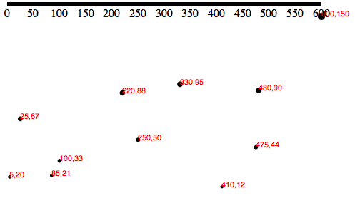
In any case, here’s what that looks like:
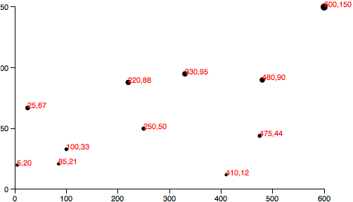
Cleaning it Up
Technically, that is an axis, but it’s neither pretty nor useful. To clean it up, let’s first assign a class of axis to the new g element, so we can target it with CSS:
svg.append("g").attr("class", "axis") //Assign "axis" class.call(xAxis);
Then, we introduce our first CSS styles, up in the <head> of our page:
.axis path,.axis line {fill: none;stroke: black;shape-rendering: crispEdges;}.axis text {font-family: sans-serif;font-size: 11px;}
The shape-rendering property is an SVG attribute, used here to make sure our axis and its tick mark lines are pixel-perfect. No blurry axes for us!
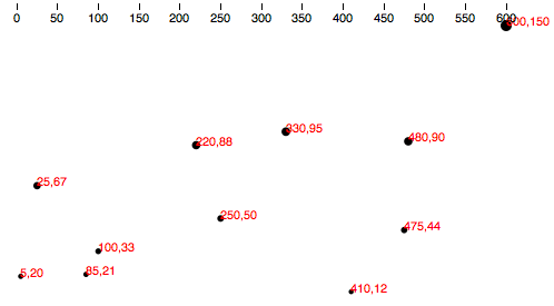
That’s better, but the top of the axis is cut off, and we want it down at the base the chart anyway. We can transform the entire axis group, pushing it to the bottom:
svg.append("g").attr("class", "axis").attr("transform", "translate(0," + (h - padding) + ")").call(xAxis);
Note the use of (h - padding), so the group’s top edge is set to h, the height of the entire image, minus the padding value we created earlier.
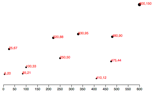
Much better! Here’s the code so far.
Check for Ticks
Some ticks spread disease, but D3’s ticks communicate information. Yet more ticks are not necessarily better, and at a certain point they begin to clutter your chart. You’ll notice that we never specified how many ticks to include on the axis, nor at what intervals they should appear. Without clear instruction, D3 has auto-magically examined our scale xScale and made informed judgements about how many ticks to include, and at what intervals (every 50, in this case).
As you would imagine, you can customize all aspects of your axes, starting with the rough number of ticks, using ticks():
var xAxis = d3.axisBottom().scale(xScale).ticks(5); //Set rough # of ticks
You probably noticed that, while we specified only five ticks, D3 has made an executive decision and ordered up a total of seven. That’s because D3 has got your back, and figured out that including only five ticks would require slicing the input domain into less-than-gorgeous values — in this case, 0, 150, 300, 450, and 600. D3 inteprets the ticks() value as merely a suggestion, and will override your suggestion with what it determines to be the most clean and human-readable values — in this case, intervals of 100 — even when that requires including slightly more or fewer ticks than you requested. This is actually a totally brilliant feature that increases the scalability of your design; as the data set changes, and the input domain expands or contracts (bigger numbers or smaller numbers), D3 ensures that the tick labels remain clear and easy to read.
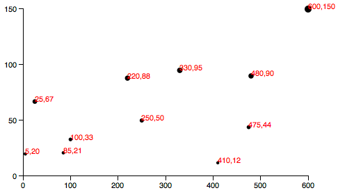
Y Not?
Time to label the vertical axis! By copying and tweaking the code we already wrote for the xAxis (and switching in d3.axisLeft()), we add this near the top of of our code
//Define Y axisvar yAxis = d3.axisLeft().scale(yScale).ticks(5);
and this, near the bottom:
//Create Y axissvg.append("g").attr("class", "axis").attr("transform", "translate(" + padding + ",0)").call(yAxis);
Note that the labels will be oriented left and that the yAxis group g is translated to the right by the amount padding.
This is starting to look like something real! But the yAxis labels are getting cut off. To give them more room on the left, I’ll bump up the value of padding from 20 to 30:
var padding = 30;
Of course, you could also introduce separate padding variables for each axis, say xPadding and yPadding, for more control over the layout.
Here’s the code, and here’s what it looks like:
Final Touches
To prove to you that our new axis are dynamic and scalable, I’d like to switch from using a static data set to using randomized numbers:
//Dynamic, random datasetvar dataset = [];var numDataPoints = 50;var xRange = Math.random() * 1000;var yRange = Math.random() * 1000;for (var i = 0; i < numDataPoints; i++) {var newNumber1 = Math.round(Math.random() * xRange);var newNumber2 = Math.round(Math.random() * yRange);dataset.push([newNumber1, newNumber2]);}
This code initializes an empty array, then loops through 50 times, chooses two random numbers each time, and adds (“pushes”) that pair of values to the dataset array.
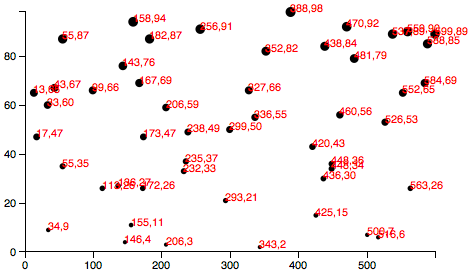
Try the code here. Each time you reload the page, you’ll get different data values. Notice how both axes scale to fit the new domains, and ticks and label values are chosen accordingly.
Having made my point, I think we can finally cut those horrible, red labels, by commenting out the relevant lines of code:
Formatting Tick Labels
One last thing: So far, we’ve been working with integers — whole numbers — which are nice and easy. But data is often messier, and in those cases, you may want more control over how the axis labels are formatted. Enter tickFormat(), which enables you to specify how your numbers should be formatted. For example, you may want to include three places after the decimal point, or display values as percentages, or both.
In that case, you could first define a new number formatting function. This one, for example, says to treat values as percentages with one decimal point precision. (See the reference entry for d3.format() for more options.)
var formatAsPercentage = d3.format(".1%");
Then, tell your axis to use that formatting function for its ticks, e.g.:
xAxis.tickFormat(formatAsPercentage);
Development tip: I find it easiest to test these formatting functions out in the JavaScript console. For example, just open any page that loads D3, such as our final scatterplot, and type your format rule into the console. Then test it by feeding it a value, as you would with any other function:
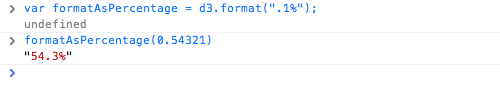
You can see here that a data value of 0.54321 is converted to 54.3% for display purposes — perfect!
Give that code a try here. A percentage format doesn’t make sense with our scatterplot’s current data set, but as an exercise, you could try tweaking how the random numbers are generated, for more appropriate, non-whole number values, or experiment with the format function itself.
Next up: Transitions →
D3 Tutorials