An SVG primer
D3 is most useful when used to generate and manipulate visuals as SVGs. Drawing with divs and other native HTML elements is possible, but a bit clunky and subject to the usual inconsistencies across different browsers. Using SVG is more reliable, visually consistent, and faster.
Vector drawing software like Illustrator can be used to generate SVG files, but we need to learn how to generate them with code.
The SVG Element
Scalable Vector Graphics is a text-based image format. Each SVG image is defined using markup code similar to HTML. SVG code can be included directly within any HTML document. Every web browser supports SVG except Internet Explorer versions 8 and older. SVG is XML-based, so you’ll notice that elements that don’t have a closing tag must be self-closing. For example:
<element></element> <!-- Uses closing tag --><element/> <!-- Self-closing tag -->
Before you can draw anything, you must create an SVG element. Think of the SVG element as a canvas on which your visuals are rendered. (In that respect, SVG is conceptually similar to HTML’s canvas element.) At a minimum, it’s good to specify width and height values. If you don’t specify these, the SVG will take up as much room as it can within its enclosing element.
<svg width="500" height="50"></svg>
Here is the SVG generated by that code:
Don’t see it? Right-click on the empty space above and choose “Inspect Element”. Your web inspector should look something like this:
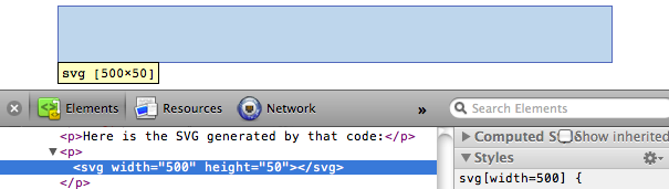
Note that there is an svg element (yay!), and that it occupies 500 horizontal pixels and 50 vertical pixels. It just doesn’t look like much yet (boo!).
Also note that the browser assumed pixels as the default measurement units. We specified dimensions of 500 and 50, not 500px and 50px. We could have specified px explicitly, or any number of other supported units, including em, pt, in, cm, and mm.
Simple Shapes
There are a number of visual elements that you can include between those svg tags, including rect, circle, ellipse, line, text, and path.
If you’re familiar with computer graphics programming, you’ll recognize the usual pixel-based coordinates system in which 0,0 is the top-left corner of the drawing space. Increasing x values move to the right, while increasing y values move down.
rect draws a rectangle. Use x and y to specify the coordinates of the upper-left corner, and width and height to specify the dimensions. This rectangle fills the entire space of our SVG:
<rect x="0" y="0" width="500" height="50"/>
circle draws a circle. Use cx and cy to specify the coordinates of the center, and r to specify the radius. This circle is centered in the middle of our 500-pixel-wide SVG because its cx (“center-x”) value is 250.
<circle cx="250" cy="25" r="25"/>
ellipse is similar, but expects separate radius values for each axis. Instead of r, use rx and ry.
<ellipse cx="250" cy="25" rx="100" ry="25"/>
line draws a line. Use x1 and y1 to specify the coordinates of one end of the line, and x2 and y2 to specify the coordinates of the other end. A stroke color must be specified for the line to be visible.
<line x1="0" y1="0" x2="500" y2="50" stroke="black"/>
text renders text. Use x to specify the position of the left edge, and y to specify the vertical position of the type’s baseline.
<text x="250" y="25">Easy-peasy</text>
text will inherit the CSS-specified font styles of its parent element unless specified otherwise. (More on styling text in a moment.) Notice how the formatting of the sample text above matches that of this paragraph. We could override that formatting as follows:
<text x="250" y="25" font-family="sans-serif"font-size="25" fill="gray">Easy-peasy</text>
Also note that when any visual element runs up against the edge of the SVG, it will be clipped. Be careful when using text so your descenders don’t get cut off (ouch!). You can see this happen when we set the baseline (y) to 50, the same as the height of our SVG:
<text x="250" y="50" font-family="sans-serif"font-size="25" fill="gray">Easy-peasy</text>
path is for drawing anything more complex than the shapes above (like country outlines for geomaps), and will be explained separately. For now, we’ll work with simple shapes.
Styling SVG Elements
SVG’s default style is a black fill with no stroke. If you want anything else, you’ll have to apply styles to your elements. Common SVG properties are:
fill— A color value. Just as with CSS, colors can be specified as- named colors —
orange - hex values —
#3388aaor#38a - RGB values —
rgb(10, 150, 20) - RGB with alpha transparency —
rgba(10, 150, 20, 0.5) stroke— A color value.stroke-width— A numeric measurement (typically in pixels).opacity— A numeric value between 0.0 (completely transparent) and 1.0 (completely opaque).
With text, you can also use these properties, which work just like in CSS:
font-familyfont-size
In another parallel to CSS, there are two ways to apply styles to an SVG element: either directly (inline) as an attribute of the element, or with a CSS style rule.
Here are some style properties applied directly to a circle as attributes:
<circle cx="25" cy="25" r="22"fill="yellow" stroke="orange" stroke-width="5"/>
Alternatively, we could strip the style attributes, assign the circle a class (just as if it were a normal HTML element)
<circle cx="25" cy="25" r="22" class="pumpkin"/>
and then put the fill, stroke, and stroke-width rules into a CSS style that targets the new class:
.pumpkin {fill: yellow;stroke: orange;stroke-width: 5;}
The CSS approach has a few obvious benefits:
- You can specify a style once and have it be applied to multiple elements.
- CSS code is generally easier to read than inline attributes.
- For those reasons, the CSS approach may be more maintainable and make design changes faster to implement.
Using CSS to apply SVG styles, however, can be disconcerting for some. fill, stroke, and stroke-width, after all, are not CSS properties. (The nearest CSS equivalents are background-color and border.) If it helps you remember which rules in your stylesheet are SVG-specific, consider including svg in those selectors:
svg .pumpkin {/* ... */}
Layering and Drawing Order
There are no “layers” in SVG, and no real concept of depth. SVG does not support CSS’s z-index property, so shapes can only be arranged within the two-dimensional x/y plane.
And yet, if we draw multiple shapes, they overlap:
<rect x="0" y="0" width="30" height="30" fill="purple"/><rect x="20" y="5" width="30" height="30" fill="blue"/><rect x="40" y="10" width="30" height="30" fill="green"/><rect x="60" y="15" width="30" height="30" fill="yellow"/><rect x="80" y="20" width="30" height="30" fill="red"/>
The order in which elements are coded determines their depth order. The purple square appears first in the code, so it is rendered first. Then, the blue square is rendered “on top” of the purple one, then the green square on top of that, and so on.
Think of SVG shapes as being rendered like paint on a canvas. The pixel-paint that is applied later obscures any earlier paint, and thus appears to be “in front.”
This aspect of drawing order becomes important when you have some visual elements that should not be obscured by others. For example, you may have axes or value labels that appear on a scatterplot. The axes and labels should be added to the SVG last, so they appear in front of any other elements.
Transparency
Transparency can be useful when elements in your visualization overlap but must remain visible, or you want to de-emphasize some elements while highlighting others.
There are two ways to apply transparency: use an RGB color with alpha, or set an opacity value.
You can use rgba() anywhere you specify a color, such as with fill or stroke. rgba() expects three values between 0 and 255 for red, green, and blue, plus an alpha (transparency) value between 0.0 and 1.0.
<circle cx="25" cy="25" r="20" fill="rgba(128, 0, 128, 1.0)"/><circle cx="50" cy="25" r="20" fill="rgba(0, 0, 255, 0.75)"/><circle cx="75" cy="25" r="20" fill="rgba(0, 255, 0, 0.5)"/><circle cx="100" cy="25" r="20" fill="rgba(255, 255, 0, 0.25)"/><circle cx="125" cy="25" r="20" fill="rgba(255, 0, 0, 0.1)"/>
Note that with rgba(), transparency is applied to the fill and stroke colors independently. The following circles’ fill is 75% opaque, while their strokes are only 25% opaque.
<circle cx="25" cy="25" r="20"fill="rgba(128, 0, 128, 0.75)"stroke="rgba(0, 255, 0, 0.25)" stroke-width="10"/><circle cx="75" cy="25" r="20"fill="rgba(0, 255, 0, 0.75)"stroke="rgba(0, 0, 255, 0.25)" stroke-width="10"/><circle cx="125" cy="25" r="20"fill="rgba(255, 255, 0, 0.75)"stroke="rgba(255, 0, 0, 0.25)" stroke-width="10"/>
To apply transparency to an entire element, set an opacity attribute. Here are some completely opaque circles
followed by the same circles, with opacity values:
<circle cx="25" cy="25" r="20" fill="purple"stroke="green" stroke-width="10"opacity="0.9"/><circle cx="65" cy="25" r="20" fill="green"stroke="blue" stroke-width="10"opacity="0.5"/><circle cx="105" cy="25" r="20" fill="yellow"stroke="red" stroke-width="10"opacity="0.1"/>
You can employ opacity on an element that also has colors set with rgba(). When doing so, the transparencies are multiplied. The following circles use the same RGBA values for fill and stroke. The first circle below has no element opacity set, but the other two do:
<circle cx="25" cy="25" r="20"fill="rgba(128, 0, 128, 0.75)"stroke="rgba(0, 255, 0, 0.25)" stroke-width="10"/><circle cx="65" cy="25" r="20"fill="rgba(128, 0, 128, 0.75)"stroke="rgba(0, 255, 0, 0.25)" stroke-width="10"opacity="0.5"/><circle cx="105" cy="25" r="20"fill="rgba(128, 0, 128, 0.75)"stroke="rgba(0, 255, 0, 0.25)" stroke-width="10"opacity="0.2"/>
Notice how the third circle’s opacity is 0.2 or 20%. Yet its purple fill already has an alpha value of 0.75 or 75%. The purple area, then, has a final transparency of 0.2 times 0.75 = 0.15 or 15%.
For more on SVG — including patterns, animation, paths, clip-paths, masks, and filters — see the “Pocket Guide to Writing SVG” by Joni Trythall as well as “An SVG Primer for Today’s Browsers” by David Dailey.