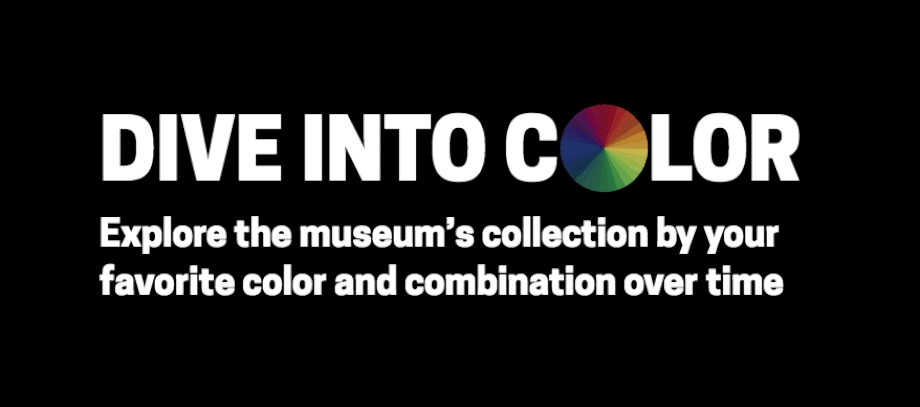
Dive into Color
Visualising the Smithsonian Design Museum collection by colour and colour harmony
Dive into Color
Developed with the Cooper Hewitt Smithsonian Design Museum, New York City
Exhibitions
‘Saturated: The Allure and Science of Color’ May 2018 – Jan 2019 at Cooper Hewitt Smithsonian Design Museum, New York City
‘Design Research Evolution’, London Design Festival 2018
Read more
Making ‘Dive into Color’ post on Cooper Hewitt Labs blog
Timeline design for visualising cultural heritage data. PhD Thesis. Chapter 6.
Code
Built with JavaScript, D3.js, ElasticSearch
Observable notebook: How to make a colour wheel palette
‘Dive into Color’ is an app for exploring the Cooper Hewitt Smithsonian Design Museum's collection of historic and contemporary design by colour and colour harmony (combinations of colours that are pleasing to the eye). It was developed during a Smithsonian fellowship and was exhibited in the ‘Saturated: The Allure and Science of Color’ exhibition May 2018 – Jan 2019 at Cooper Hewitt Museum, New York City. For a more detailed write-up of the design and development process, see the blog post Making Dive into Color.
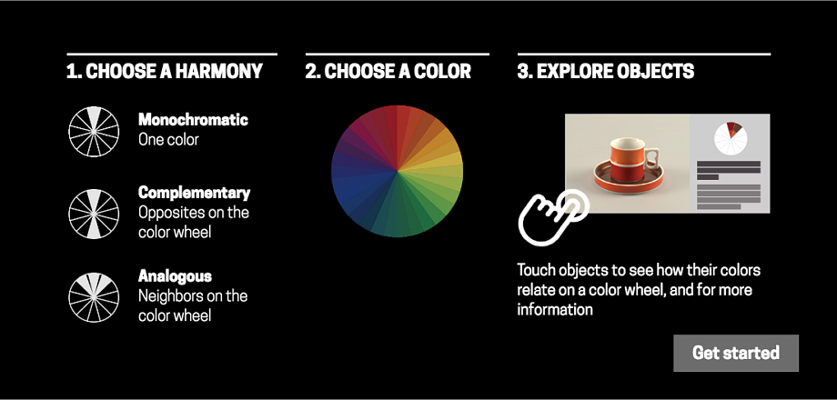
Searching by colour has been a popular feature on the Cooper Hewitt museum's collections website. Building on that idea, this app allows users to also search by colour relationships or colour harmonies. Complementary colours, for example, appear opposite one another on the colour wheel, while analogous colours are close together.
Colour harmonies produce different visual effects, for example:
- a monochromatic scheme (using variants on one hue) creates a sense of visual cohesion
- complementary colours (opposites on the colour wheel) create a strong, vibrant contrast
- analogous colours (neighbours on the colour wheel) produce a more harmonious effect
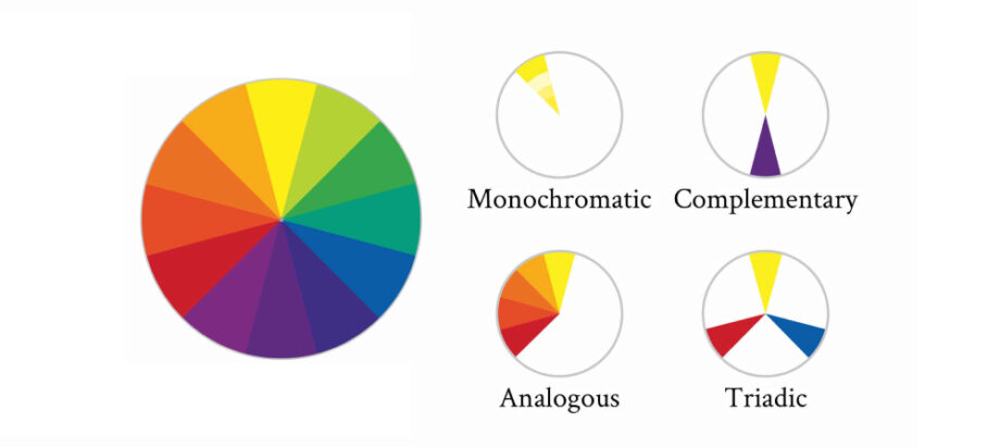
Colour harmonies
The results are displayed on a timeline. This makes it possible to spot trends and fashions, and innovations in pigments and dyes, which constrained the range of available colours.
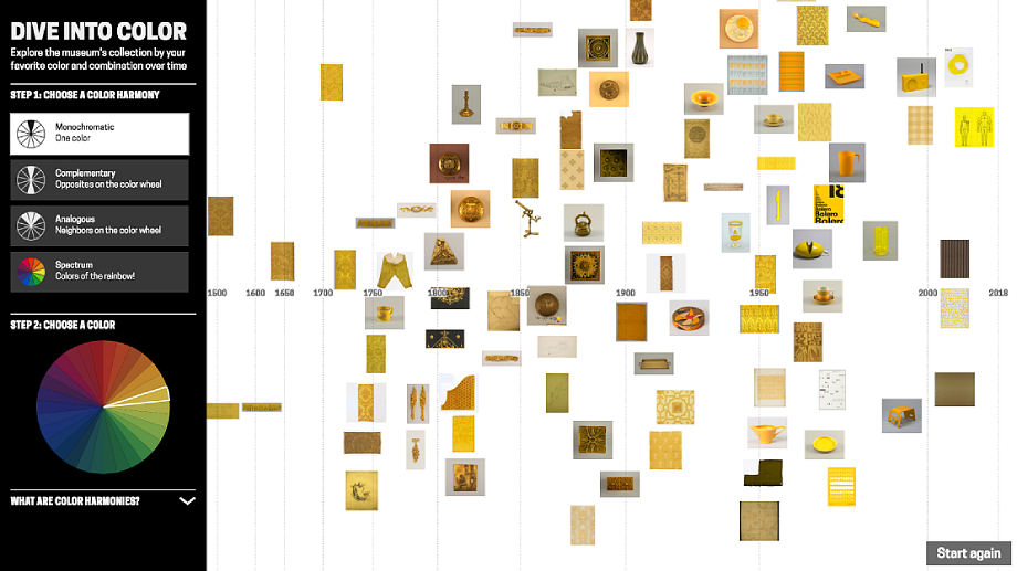
‘Dive into Color’ showing yellow objects from the collection mapped by date
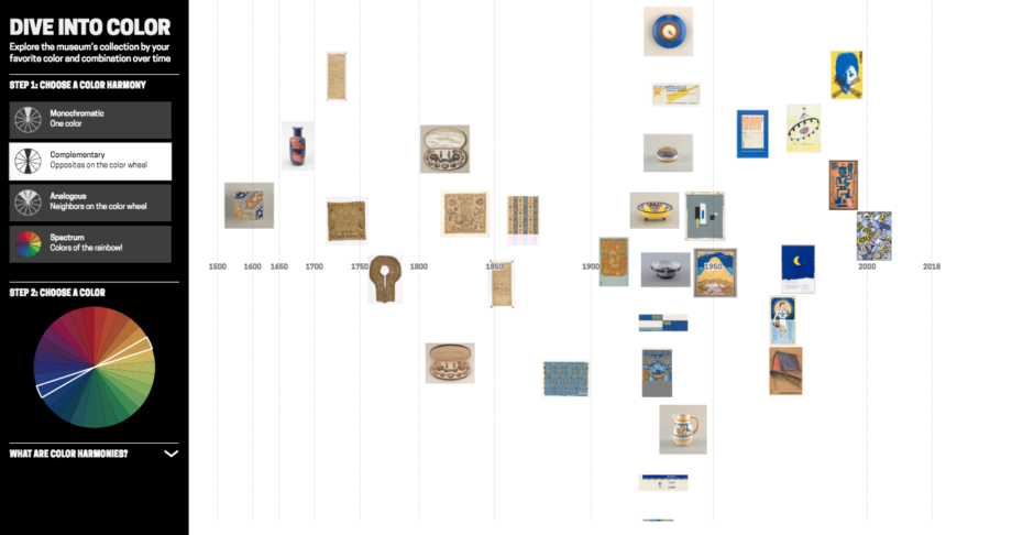
‘Dive into Color’ showing objects from the collection featuring blue and yellow (colour wheel opposites) mapped by date.
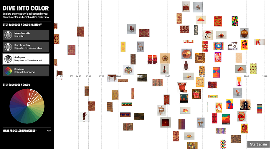
‘Dive into Color’ showing objects from the collection featuring red round to yellow colours mapped by date
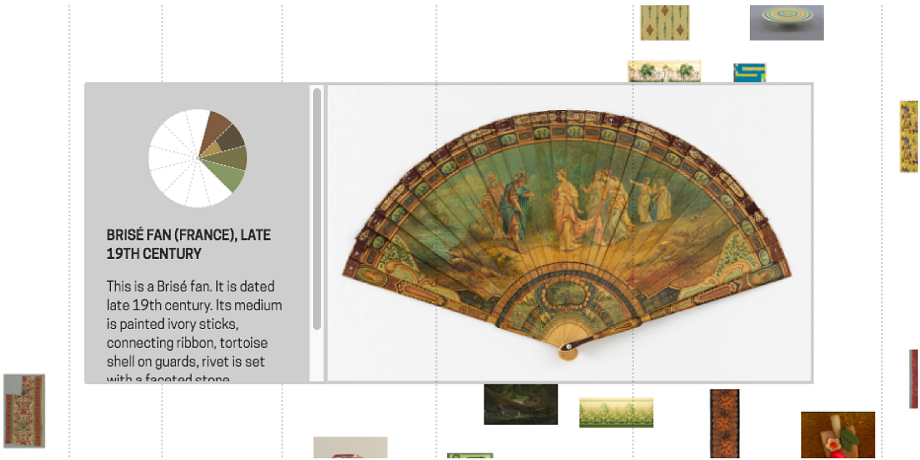
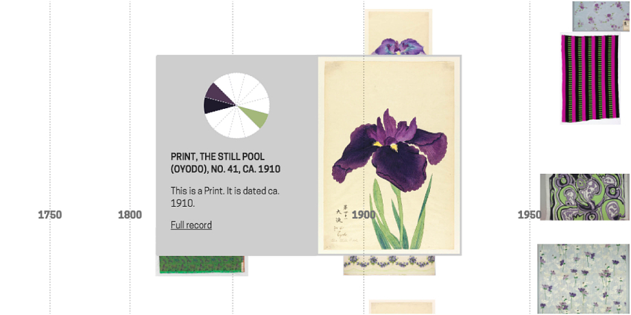
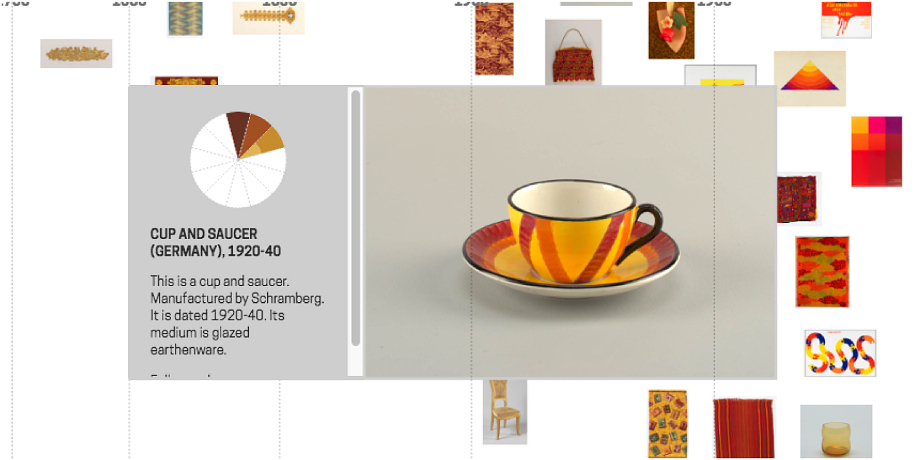
Selecting an image from the timeline brings up more information about the object and a graphic showing the object's colour palette mapped to a colour wheel. This graphic reveals the colour relationships in the object's design.
‘Dive into Color’ exhibited at Cooper Hewitt. Photo credit: Caroline Koh Smith.
Detail from ‘Dive into Color’ showing selected images
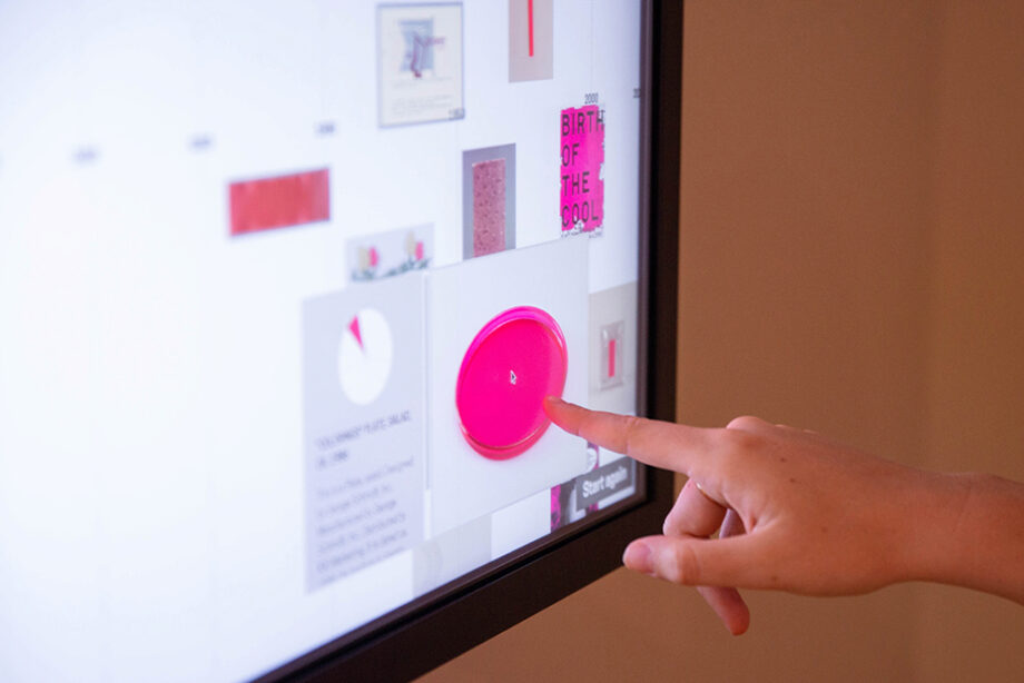
For the ‘Saturated: The Allure and Science of Color’ exhibition, 'Dive into Color' was exhibited in the museum on a touchscreen, allowing visitors to explore the collection themselves.
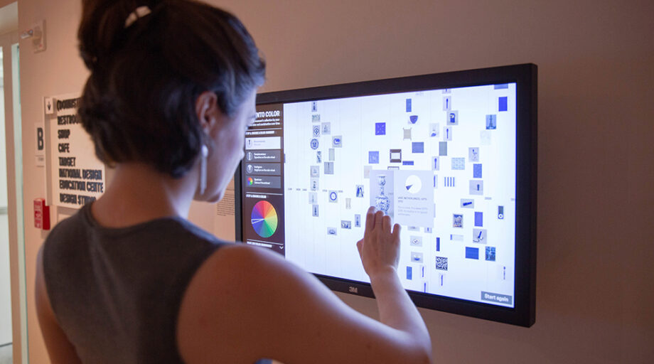
‘Dive into Color’ exhibited at Cooper Hewitt. Photo credit: Caroline Koh Smith.
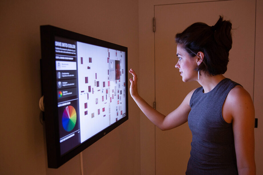
‘Dive into Color’ exhibited at Cooper Hewitt. Photo credit: Caroline Koh Smith.